Coded Websites - Interactive Narratives


Overview:
A pair of major projects for a class (Interactive Media 1) was creating content and building websites for that content. We were required to only use HTML and CSS, and thus had next to no animation. The other requirement was to design for a limited range of screens sizes: larger than 1200px wide, and narrower than 700px, i.e., desktop and mobile views.
Timeline:
Sept – Dec 2021
Tools Used:
HTML, CSS, Adobe Illustrator, Figma, Adobe Photoshop
Design Process:
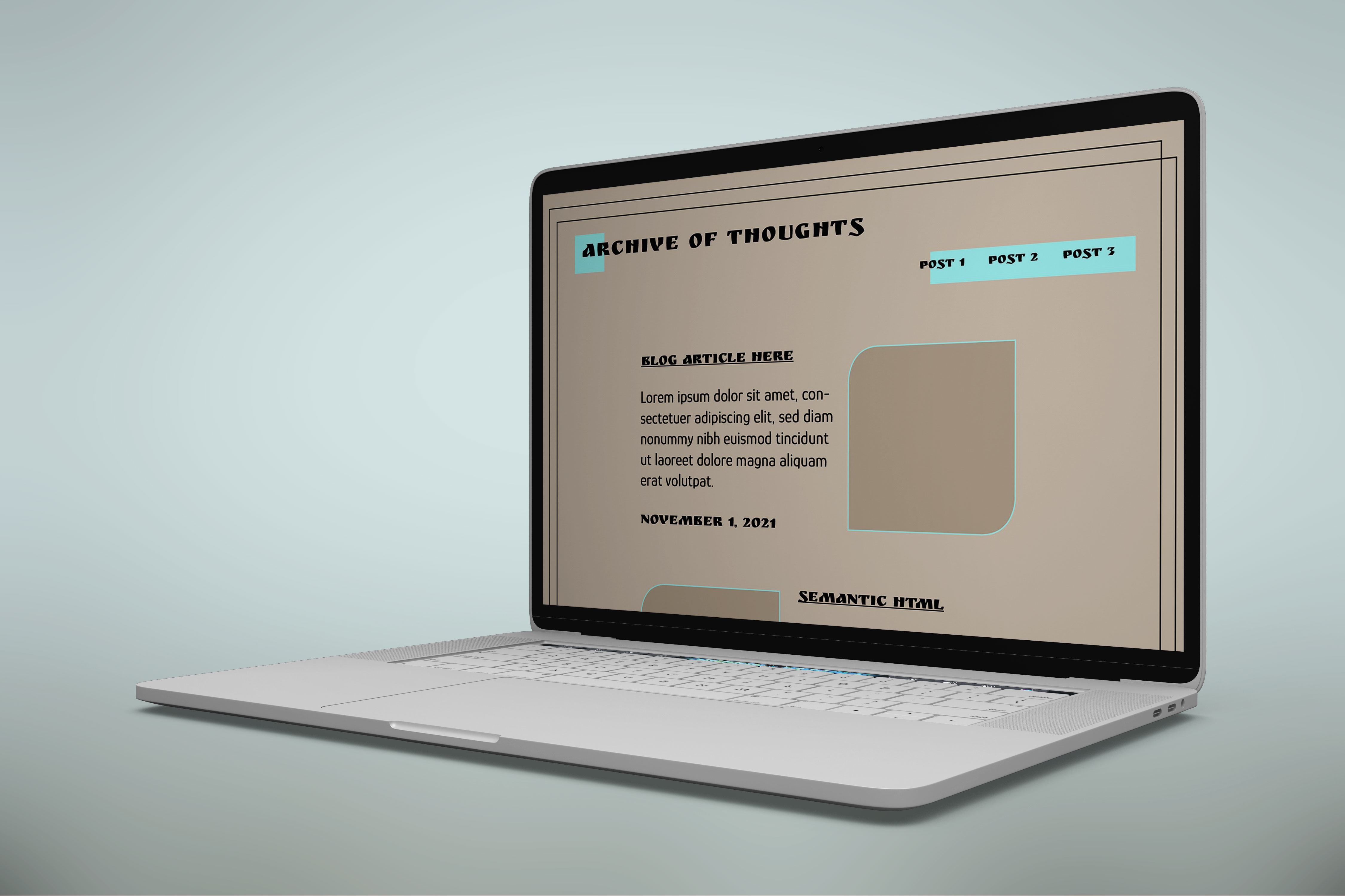
I called website 1 “Archive of Thoughts”, and it was designed to be a blog website, with posts based on in-class assignments. My design inspiration was to be contrary to my design preference, which is minimal and easy to read. I had recently come across a color pairing that caught my interest: bright neons with earthy beiges and a strong black. And so, choosing a teal neon as my accent color, a color scheme for the website was born.
I originally ideated a complex layout, but it turned to be much harder to execute in the given time frame than I thought it would. As a result, I simplified the layout as much as I could, so that the focus could be on content. View blog here.
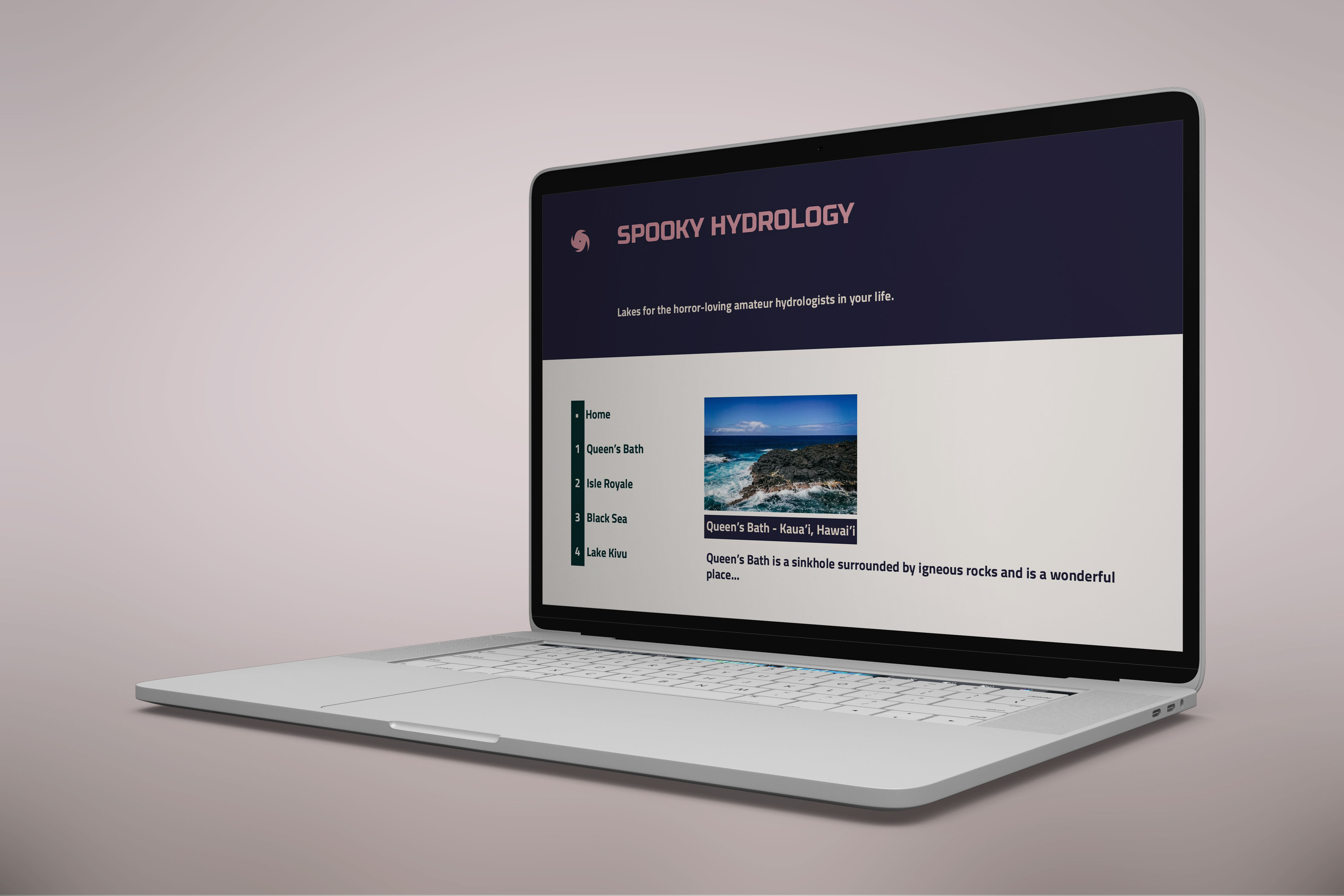
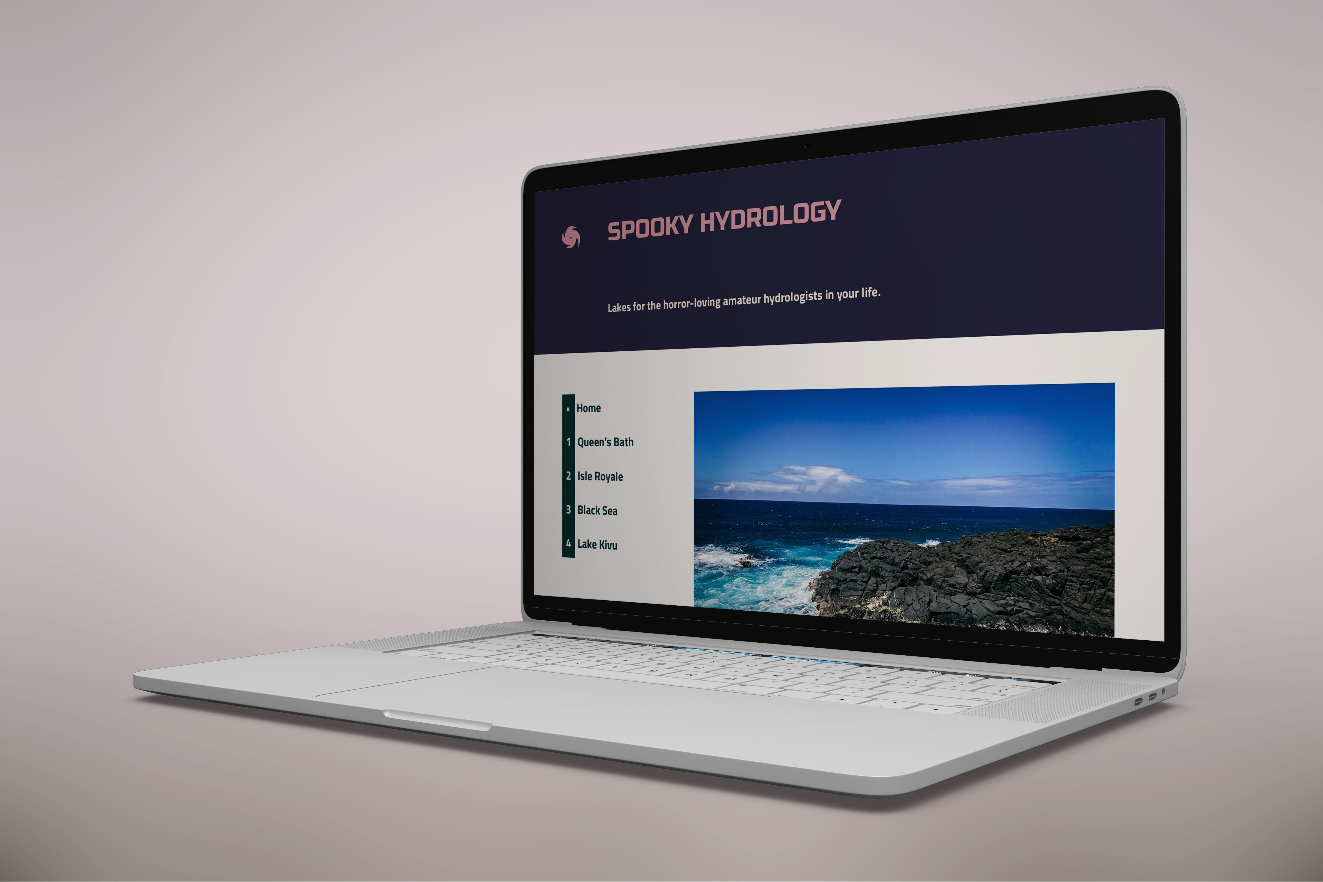
When it came to my second website for the class, I had learned my lesson with have multiple complex features. I thus decided to pare on all elements and have one stand-out complex item to code – which in this case was the side menu. For this website, we were required to stick to a theme (a narrative). I settled on a theme of lakes to which some scary phenomena were associated, and aptly called the website “Spooky Hydrology”. I interestingly struggled with color here, because a lot of the colors I had originally picked did not translate well and looked rather strange together – I ended up overhauling the scheme multiple times, until I found one that looked good and suited the theme. View narrative here.
My overall lesson learned with both websites was to let the content speak for itself, and to use the content to inspire the design instead of the other way around. I also learnt a hard lesson in designing according to the time crunch, and I finally understood the struggles of a software engineer.

